Wellness Room Paint Colors That Actually Hold Up
Paint is the cheapest change in the room and the one that gets the most decisions wrong. A wellness room, more than most rooms in the house, is asking its walls to do specific work. Support morning energy, support evening rest, coordinate with the largest floor surface, and read as calm without reading as beige.
The colors designers keep returning to for wellness rooms are not the ones the trend feeds suggest. They are quieter, warmer, and chosen for how they behave across the day, not for how they photograph on a sunny afternoon.
What a wellness room needs from its walls
Three questions decide almost every paint choice.
How does the color read in morning light versus evening light. Most wellness rooms are used at both ends of the day. A color that looks warm and inviting at seven a.m. can turn grey and clinical at seven p.m. under lamp light. The color has to work in both windows.
How does the color relate to the floor. The mat, rug, or floor surface is the largest single element in most wellness rooms. The wall color has to coordinate with it, not compete with it.
How does the color read to the body. Bright saturated colors elevate heart rate. Cool blues and greens lower it. The wellness room is often trying to do both across the same day, which is why a middle path tends to work better than a strong one.
The color families that consistently hold up
Warm off-whites. Not stark white. A white with warmth in it. Benjamin Moore White Dove, Sherwin-Williams Alabaster, Farrow & Ball Pointing. These read as clean without reading as cold, and they hold up across morning and evening light better than any true white.
Soft greiges. A grey with warm undertones. Benjamin Moore Balboa Mist, Sherwin-Williams Agreeable Gray, Farrow & Ball Skimming Stone. Neutral enough to work with most floor colorways, warm enough to feel like a residential room rather than a commercial one.
Muted sages. A green that has been quieted down with grey. Benjamin Moore Saybrook Sage, Farrow & Ball Mizzle, Sherwin-Williams Evergreen Fog. Sage supports a restorative session in a way saturated greens do not, and it coordinates with warm oak, walnut, and travertine floors.
Warm clay tones. Terracotta or plaster tones with warmth. Farrow & Ball Setting Plaster, Benjamin Moore Head Over Heels, Sherwin-Williams Malabar. These read as anchoring and calming, especially in a room with lower ceilings or limited natural light.
Deep saturated darks for evening-heavy rooms. If the wellness room lives in a basement or a north-facing space and is used mostly in the evening, a saturated dark can hold the room better than a light color. Farrow & Ball Down Pipe, Benjamin Moore Kendall Charcoal. These work best with layered warm lighting, so plan lamps before committing.
The colors designers tend to avoid
Pure white. Reads as clinical, hospital-adjacent, and unforgiving. Every scuff, mark, and dust line shows.
Cool grey. Trended hard a decade ago. Reads as cold in morning light and dead in evening light. Ages the room fast.
Bright accent walls. A single wall in a saturated color rarely does what the design intended. It fights the floor covering and pulls the eye away from the movement space toward the wall.
Trend colors of the year. Wellness rooms are long-term rooms. A color chosen because it is the color of the year in September will feel dated by the following spring. Choose from a palette that lives beyond the trend cycle.
How to coordinate paint with the floor covering
Because the mat or rug is the largest single surface in the room, choosing the wall color first and then the mat is backwards. Choose the mat first. Then pull the wall color from the same palette family as the mat.
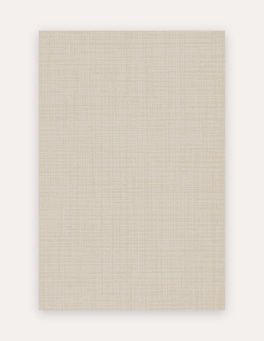
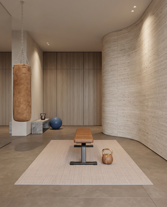
A warm greige mat wants a warm off-white or a soft warm greige wall. A sage-toned mat wants a warm off-white or a soft sage wall. A deep midnight-blue mat can carry a warm off-white wall, a soft warm greige, or a saturated dark ceiling. A warm camel or terracotta mat wants a warm off-white or a plaster-tone wall.
The rule is simple. The mat and the walls should share undertones. Warm goes with warm, cool with cool. Cross-family combinations require a designer's eye and often do not hold up when the light changes.
How to test paint before committing
Never commit to a paint color from a swatch card. Two ways to test that consistently work.
Order large peel-and-stick paint samples. Put them on more than one wall. Look at them at seven a.m., at noon, at six p.m., and after dark under lamp light.
Hold the paint sample against the actual floor covering. If the mat is not in the room yet, hold the paint sample against the mat swatch or the rug swatch. A color that agrees in isolation can disagree next to the floor.
Where Swankymat fits
Swankymat is built on non-toxic high-density foam with a supportive cushion under knees, wrists, and hip bones. Hand-drawn patterned designs in restrained residential palettes, chosen specifically to coordinate with the wall colors designers actually use in wellness rooms. Sloane Dust and Arlo Olive sit under warm greiges and sages. Rhodes Camel sits under plaster tones and warm off-whites. Sloane Midnight and Sloane Forest work with saturated dark ceilings or crisp warm off-white walls. Single-piece construction with no bonded top layer, so the mat presents as one clean surface against the paint rather than as gridded tiles or a rolled-up strip.
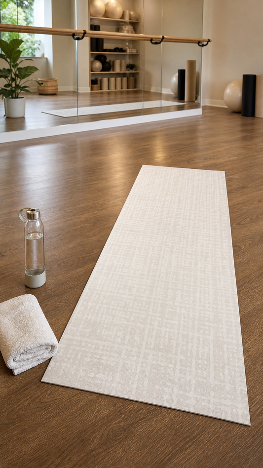
Available in Oversized 5x7 (60 by 84 inches) for a defined movement zone, Oversized 6x9 (72 by 108 inches) for a full-room anchor sized like a standard area rug, and the rollable Studio Mat (26 by 71 inches) for smaller rooms.
Pro Access for design professionals
Swankymat runs Pro Access for interior designers, home stagers, and realtors. The program is a value and enablement offer, not a discount program. Everyone pays full price. Pros get complimentary swatches for client paint-and-floor coordination, free personalized cards printed four by six inches with your own artwork and shipped with the mat to your client at no cost, client-ready spec sheets, the Styling Lookbook to share, and early access to new styles. Apply at swankymat.com/pages/pro-access. Reach out at pro@swankymat.com.
The Confidence Path to the Right Mat
Two low-risk starting points work well for anyone weighing the decision.
The Perfect Match Quiz takes sixty seconds and recommends a colorway and size based on the room and how it will be used. Free.
The swatch pack ships three real material samples for $15, credited to your mat. Holding the samples against your paint chips is the reliable way to confirm the palette before ordering. Ordering swatches first unlocks the No-Sweat Guarantee. If you don't love your mat when it arrives, switch it within seven days, completely free. Swankymat pays return shipping. Swatch it, switch it free.
The Swankymat Promise
Every Swankymat is backed by four commitments. Built to Last, Backed for a Year, a one-year quality guarantee on manufacturing defects and premature wear. Easy 30-Day Returns, so you can live with your mat and send it back within thirty days if it is not right. Spills Happen, waterproof and wipe-clean, so real life wipes right off. No-Sweat Guarantee, for anyone who orders a swatch pack first. Free shipping on all orders in the Continental US, including HSA and FSA orders through TrueMed.