


The Most Stylish Exercise Mats of 2026, Organized by Interior Style
The exercise mat category has become a design category. What used to be black foam sold at gyms is now a design decision on par with choosing an area rug or a piece of art. The 2026 lineup reflects the shift. Patterned, palette-driven, sized as furniture rather than as equipment.
This post organizes the most stylish exercise mats of 2026 by the interior style they suit best, rather than by brand or price. The frame is more useful because most customers know their room aesthetic before they know which mat brand they want.
Minimalist
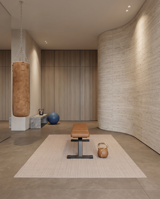
Minimalist interiors call for a mat that reads as a designed object without adding visual noise. Solid neutrals, subtle textural patterns, restraint on color contrast. The mat should feel like part of the palette rather than an insertion into it.
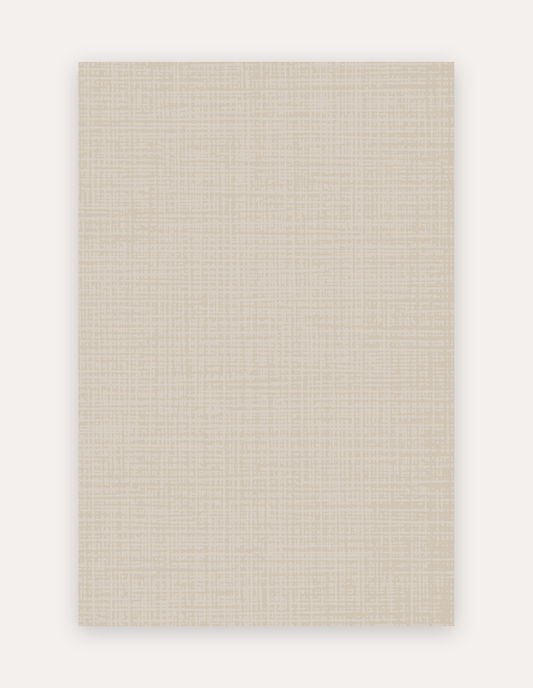
The Swankymat Sloane Dust fits this category. Ivory ground, hand-drawn crosshatch in a warm neutral basque tone, no saturated color anywhere in the palette. In a minimalist room with cream sofas, wood floors, and quiet artwork, Sloane Dust reads as texture rather than as pattern.
Warm Neutral
Warm neutral rooms lean into camel, sand, oat, and honey tones. Wood is warm. Textures are woven. The mat should carry the warmth rather than cool it down.
Rhodes Camel is the natural fit here. Soft pink and light beige tones in a hand-drawn watercolor pattern, calibrated to sit alongside camel leather, oat linen, and stained wood without competing. Rhodes Camel is the mat that most often gets described as feeling like part of the room rather than as workout gear.
Modern Coastal
Modern coastal is not the coastal grandmother aesthetic. It is a restrained palette of soft blues, sandy neutrals, natural fibers, and cool cream. The mat should suggest water without shouting it.
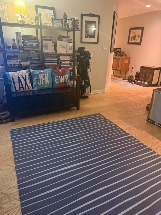
Wavy Cove works here. Deep blue base with cool cream vertical lines that recall linen weave and gentle water movement. It anchors a modern coastal room without pushing into nautical decor territory.
Sophisticated Dark
Rooms built around darker anchor colors (deep charcoal, navy, oxblood, forest green) benefit from a mat that carries the depth rather than lightening it. Dark walls, warm wood floors, brass and leather accents. The mat has to hold its own without disappearing into the floor.
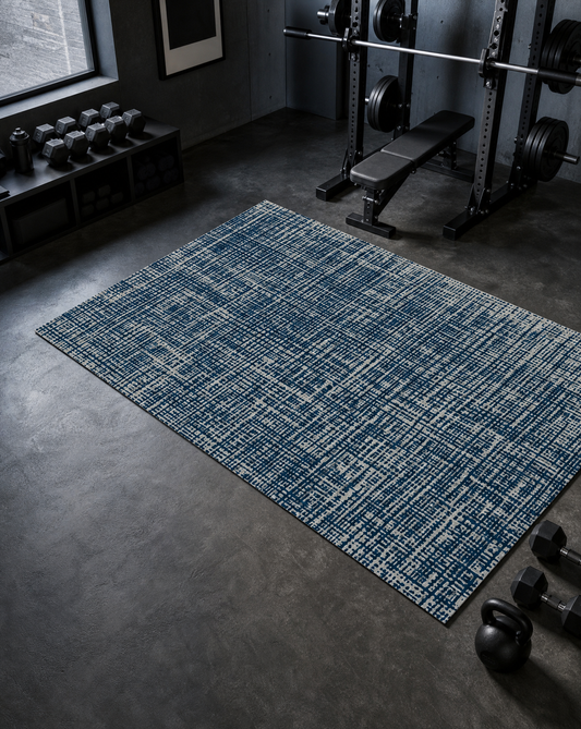
Sloane Midnight, new in 2026, sits in this category. The deepest blue Swankymat has released, hand-drawn crosshatch over a soft linen-textured ground. It reads as a deliberate anchor in rooms where the palette is intentionally restrained. For more on the color specifically, the post on introducing Sloane Midnight covers the palette in detail.
Pattern-Forward
For rooms designed around considered pattern (a striped wallpaper, a Persian-inspired rug in another room, a piece of graphic art), the mat can carry more visual weight without competing. Hand-drawn linework, geometric structure, or organic movement all fit.
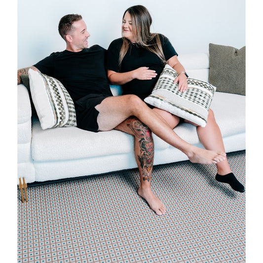
Avalon Clay and Navy is the pattern-forward option. Traditional tilework and global artisan motifs in warm terracotta and deep blue. It reads as a woven textile rather than as a mat, which is the difference between a pattern-forward mat that works and one that reads as busy.
The Common Thread
The mats above share a construction principle rather than an aesthetic one. Every one is single-piece non-toxic high-density foam with 6mm of supportive cushion, a waterproof wipe-clean surface, and Greenguard Gold certified inks. The construction is what allows the mat to live on the floor permanently, which is what makes the aesthetic decision matter in the first place.
For a deeper look at how mat aesthetics fit into modern home design, the post on choosing the perfect neutral mat covers palette decisions in detail. For the broader case for a mat that reads as decor rather than as gym gear, the post on a decorative yoga mat covers the argument.
Seeing the Style in Your Room
Colors read very differently in a home than on a screen. A palette that reads as warm neutral on a monitor often reads as pinker or more saturated against actual paint and wood. The swatch pack ships three real material samples so you can see the colors and texture in your space, which is the most reliable way to see how a style reads in the room it will actually live in. Browse the full mat collection to compare palettes side by side.