


The Wellness Corner: Designing a Calm Movement Space at Home
A wellness corner is a small, designated zone in a home (usually 35 to 45 square feet) intended for movement, breath work, stretching, and rest. The corner is not a home gym, not a yoga room, not a meditation room. It is a single area, often within a living room or bedroom, that signals quietly that this is the space for slowing down.
The design logic is straightforward. Having a dedicated space removes friction from the practice. Returning to the same spot daily compounds the habit. The visual cue (a mat on the floor, a plant nearby, a basket of props) reinforces that the activity belongs in the home rather than being something that requires going somewhere else.
Why a Designated Space Works
Behavioral research is consistent on one point: tying a practice to a specific physical location dramatically improves the odds it sticks. The reason is partly cognitive and partly emotional. The space cues the practice without conscious decision-making.
For movement practices in particular, the alternative is what most people experience now: pulling out a mat when there is time, setting up in different rooms on different days, and rolling everything away after. The transition cost is small per session and substantial across a month. A designated corner removes the cost entirely.
The Five Elements
A wellness corner functions on five components. None of them are particularly expensive, and the corner works in a 600 square foot apartment as easily as in a larger home.
1. The Surface
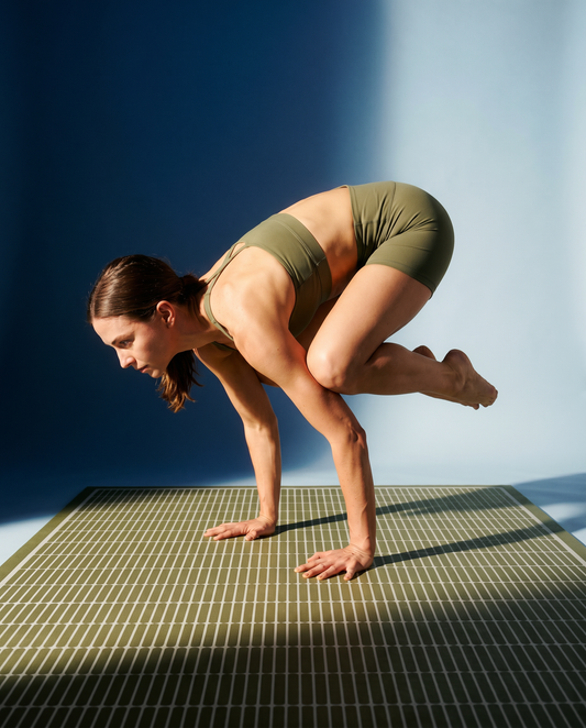
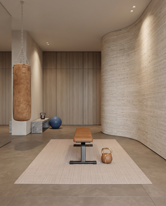
A cushioned, comfortable floor surface large enough to support the practice. This is the foundation, both literally and visually. It signals that this is the spot.
2. Lighting
Lamp-level lighting tends to work better than overhead fixtures. A single floor lamp or a wall sconce that can dim creates a calmer atmosphere than ceiling lights. Natural light helps if the corner sits near a window.
3. One Plant
A single sculptural plant in a considered pot adds scale and life without crowding the space. An olive tree, a fiddle leaf, a large pothos, or a small palm. The plant does the visual job of multiple smaller objects.
4. Storage
A woven basket or low bin for whatever props the practice requires. Yoga blocks, bands, a folded blanket, a foam roller. The basket reads as a design choice rather than a gear pile.
5. One Object of Beauty
A single intentional object. A ceramic vase, a stack of design books, a piece of art on a low shelf, a candle. This signals that the space was designed rather than assembled from leftover gear.
That is the whole list. Five elements, and the wellness corner reads as a piece of the home rather than as a workout zone.
Where to Put It
Three placements work in most homes.
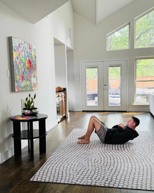
A corner of the living room, six to eight inches in from the walls on each side. The mat reads as an area rug in this position. The basket and plant sit nearby.
The foot of the bed in a bedroom. The mat occupies otherwise-empty floor and anchors the room. The morning practice is twelve steps from where you wake up.
An underused alcove, dining nook, or transition space. A wellness corner often makes a dead piece of the home actively useful.
For more on integrating a movement space into a small apartment specifically, the post on setting up a home workout space in a small apartment covers the constraints in detail.
The Aesthetic
Most well-designed wellness corners share three aesthetic principles.
Restraint. Fewer objects, each chosen with intention. A wellness corner with twelve items reads as cluttered. A wellness corner with five reads as calm.
Warm neutrals. Cream, oat, sand, taupe, soft green, deep blue. Loud colors disrupt the calming function of the corner.
Natural materials. Wood, linen, ceramic, jute, plant fibers. These textures read as warm and grounded rather than synthetic.
Choosing the Color That Quiets the Room
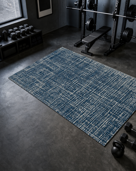
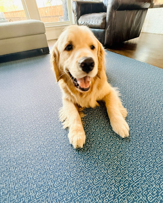
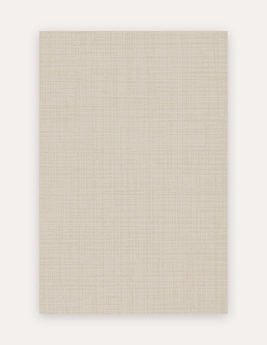
For a wellness corner where the surface needs to disappear into the space rather than draw attention, the quieter Swankymat palettes work best. Sloane Dust (ivory crosshatch), Rhodes Camel (warm pink-beige), Circa Sandstone (organic dotted neutral), and the deep Sloane Midnight all read as part of a designed room rather than as gym equipment.
For more on aesthetic decisions specific to a calming surface, the post on choosing the perfect neutral mat covers palette decisions in detail. Browse the full neutral mats collection to compare colors side by side, or the swatch pack ships real material samples so you can see how a color reads in your light before committing.